About This Project
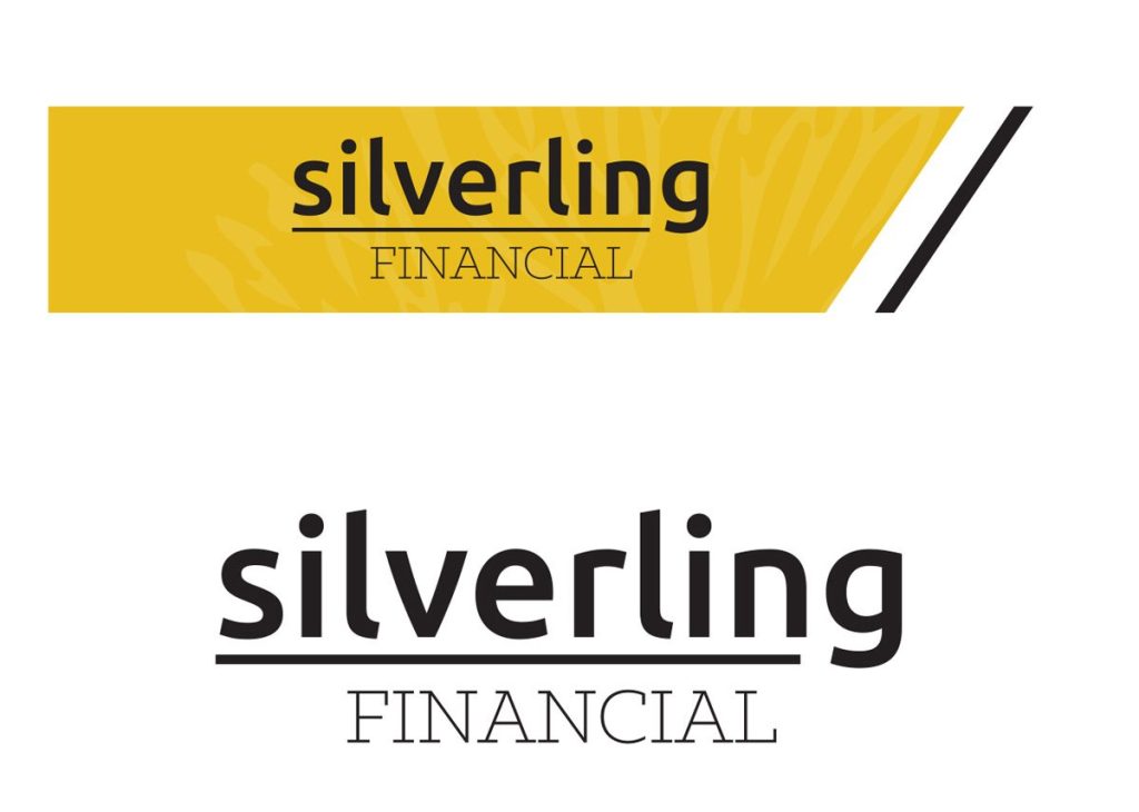
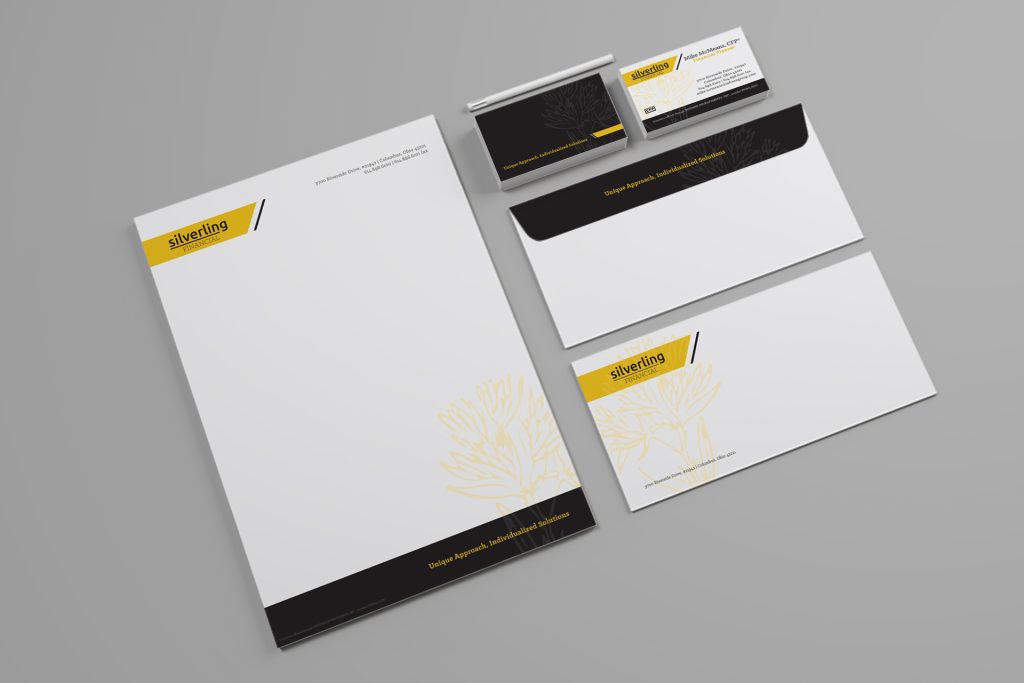
Another financial branding project I worked on was for Silverling Financial. Silverling is an investment and financial advising company located in Columbus Ohio. The name came from a little know plant in the Outer Banks called a Silverling. The owner’s idea stemmed from this favorite vacation spot and the name of the company and premise behind the logo creation was born.
I used a non-traditional financial color palette. I wanted something that has energy but is still very classy and subtle. The strength of the different tones of black and muted grays paired with the bright yellow really have a stability and contrast that work well together. The logo mark consists of a typographic style but has the option to be meshed with the bar flag that includes the ghosted Silverling.