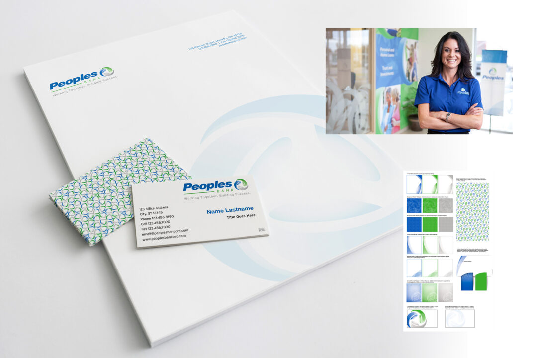
A Unified Vision
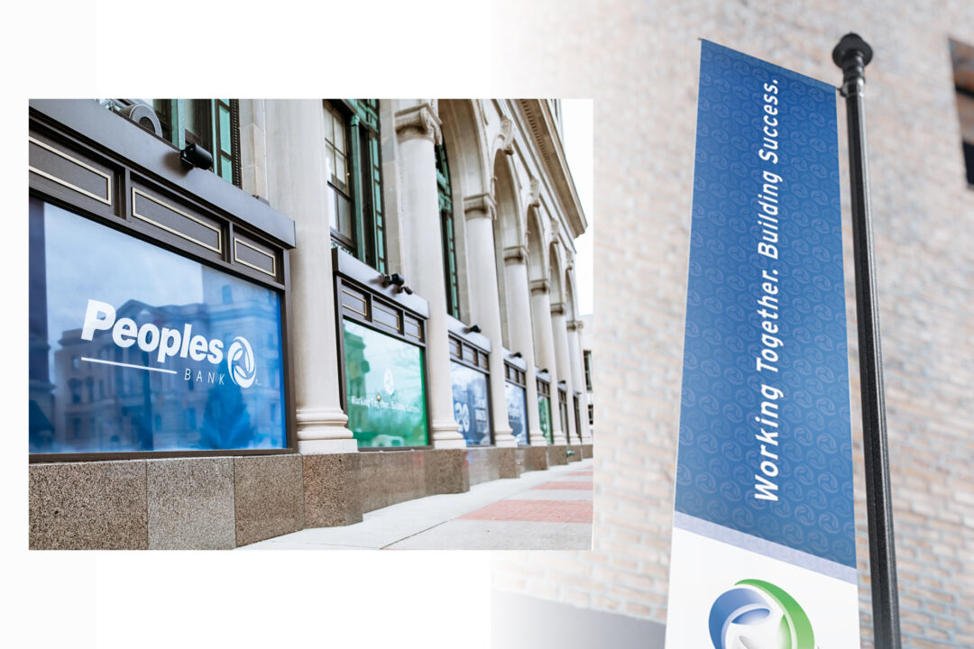
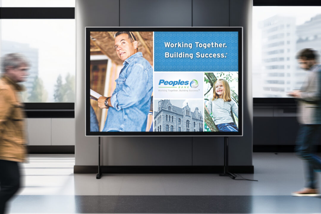
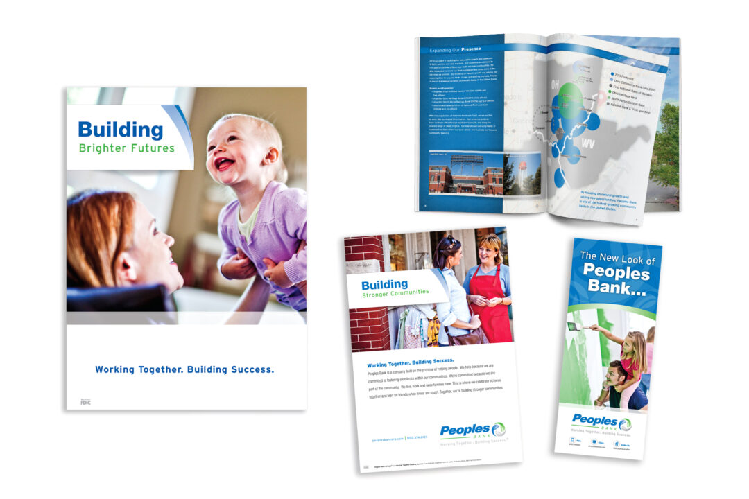
I led the creative direction for Peoples Bank’s full-scale rebrand—an initiative designed to modernize the organization’s identity and strengthen its connection to community, trust, and long-term success. At the center of the refresh was a new logo built from three interlocking ribbon forms, symbolizing the unified strength of the bank’s core offerings: banking, insurance, and investments. This visual concept informed a complete identity system, including signage standards, collateral, point-of-sale merchandise, internal brand audits, and a cohesive library of product photography.
Working closely with internal stakeholders, my team helped articulate brand values such as commitment, care, and partnership, which shaped the messaging and guided every design decision. The resulting system reinforced approachability, clarity, and credibility across all touchpoints, aligning the refreshed identity with the bank’s strategic goals and desired customer experience.
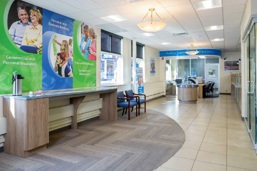
A major component of this project involved transforming the in-branch environment. As the creative liaison with architectural partners, I oversaw the redesign of multiple branches to create modern, welcoming spaces with improved wayfinding and a consistent visual language. These updates elevated customer perception and strengthened Peoples Bank’s presence within the communities it serves.